A red logo, a flaming N, a TOUDOUM that makes your TV shake, just by describing these three elements, you recognize directly which brand it is about, and you are not mistaken, we are talking about Netflix.
But then what is behind this identity?
Indeed, the streaming brand knows how to be recognized. And yet it has a logo composed of the name of the brand in, the use of a unique red color, the typeface Netflix Sans owner close to the very known and used Helvetica, the associated sound using the same 2 notes; you will have understood behind the worldwide success of the iconic brand is finally hiding a simplistic identity, in line with a service implanted in our daily lives.
A unique identity that the brand owes to the redesign work done by the New York Design Branding agency, Gretel, in 2016. The agency has simplified the logo, creating a short version with a simple N emblem, like a folded paper, reminiscent of the pages of a catalog. This shortened logo becomes a real stamp that can be used on all the brand’s content and recognized in a glance, it is a concret proof of the notoriety of Netflix and is the origins of its nickname, the « Big Red N ».
The agency is also at the origin of the Stack, a particular design of the platform and communication supports of the brand, which reminds an infinite catalog. For this design nothing complicated, the agency proposes the brand’s proprietary red accompanied by white and black. The identity is therefore pure and classic, allowing to propagate a universal brand message, which marks us all around the world.

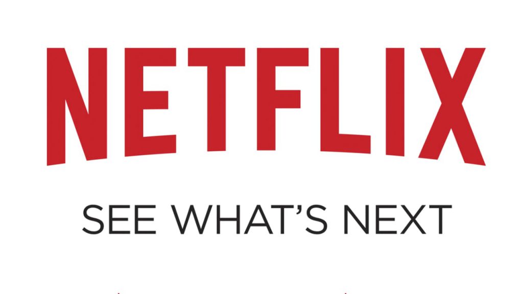
Last but not least, the agency conceptualized the brand's new tagline, still used today.
A tagline that intrigues, and reminds the service of the platform: you just finished your series/movie? No worries, see what’s next. The tagline thus leans on the richness of the contents proposed on Netflix and invites everyone to explore and discover.
A « next » that also supports the innovative character of the platform and holds us in waiting for the future innovations it will offer.
The identity of Netflix is one of the keys to its success, simple and timeless; it knows how to be noticed without shouting. From its visuals, the brand knows how to integrate smoothly in our daily life, without doing too much.
____________ Noémie TSILA
Word count: 408
Illustrations –
Gretel. (2016). Netflix: N logo [Illustration]. Gretel. https://gretelny.com/netflix
Gretel. (2016). Netflix: The slack Design [Illustration]. Gretel. https://gretelny.com/netflix
Gretel. (2016). Netflix and Tagline[Illustration]. Etapes.com. https://etapes.com/identite-visuellenetflix-en-remet-3-couches/
1 thought on “Netflix: A Recognizable Brand that we can’t Miss”