Founded in 1972 by Time Inc., Home Box Office (HBO) is a cable television service specialized in airing uncut and commercial-free movies to its subscribers at an extra cost. It bought the rights to recent movies and transferred them to the local system via his, her, their, etc. satellite and microwave relays.
The beginning
At the beginning of its launch, HBO faced market fragmentation, lack of infrastructure, and though federal rules that were backed up by some major TV networks who feared that HBO will gradually take away much of their audience and revenue. Soon after, growth occurred.
HBO expanded its infrastructure in highly populated areas like and Boston and won a lot of court cases that removed different federal limitations.
The number of users increased from 50,000 in 1974 to around 1.5 million in 1978. HBO quickly became a pioneer in driving the growth of the cable industry. In 1978, however; Showtime, HBO’s main competitor, started to highly challenge HBO for the cable film audience.
Showtime’s parent company, Viacom, closed a deal with Teleprompter, the largest cable system operator in the US. As a result; Teleprompter’s customers received Showtime instead of HBO. In the 1980s, HBO started to produce its series and at the beginning of the 1990s, it expanded the production of such series’ type. Their productions became popular and were lauded by critics as including a lot of details and very rich characters. Now, the network features theatrically released motion pictures and original television shows in addition to made-for-cable movies and documentaries, occasional comedy and concert specials, and boxing matches.
What about their logo?
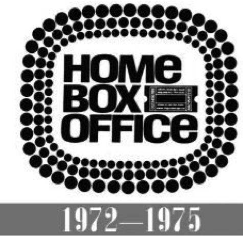
The black and white palette is HBO’s signature feature. According to the author Roman Rogoza in his article “HBO logo: The Power of Consistency,” it is more related to prestige, which is the brand’s exact message. He also believes that the black and white colors are always edgy and stylish unlike the rest of the colors that can get affected by the lack of quality and need to be rechecked constantly. If we compare their logos throughout the years, we will notice that the first HBO logo was very direct. It aimed to promote the idea of a comfortable home cinema and was written as “Home Box Office.”
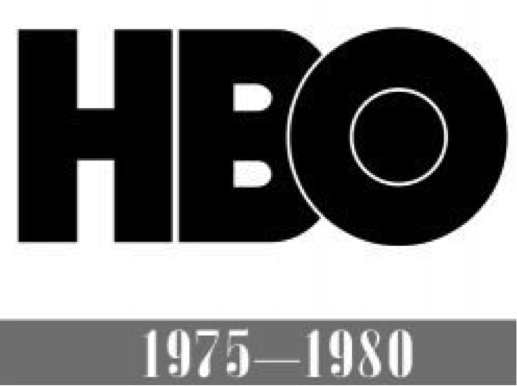
In 1975, however; a different logo was designed using the brand’s abbreviation “HBO”. It was an indication that the network has a reached high popularity and no longer needs to write the whole name to be identified.
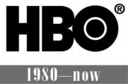
Starting 1980, a small change took place. A thinner version of the letter “B” and more space between the big and small “O” was designed for a clearer view to the user.
HBO’s logo is written in sans serif uppercase bold typeface.
I always hear a sound accompanied by their logo reveal…what is that
This sound that usually accompanies the logo reveal is most known as the “Static Angel.” It was first launched back in 1993 and in 2017 a fresh take was added to it through a brand campaign that included characters from its programming singing “ahhhhh” that gradually fades away.
HBO’s logo is written in sans serif uppercase bold typeface.
So now….what are HBO’s assets? And how are they used?
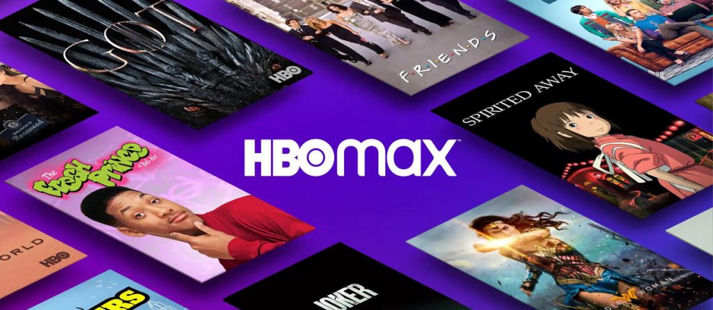
The brand’s main assets are HBO and the newly added HBO Max. The second one is a replacement for HBO Now and HBO Go is more like an upgrade to the original HBO. It offers a larger streaming library to its current users at no extra cost.
HBO and HBO MAX have social media accounts on Twitter, Facebook, TikTok, Instagram, and YouTube with Facebook being their most popular platform until now. HBO has around 12 million Facebook likes while HBO MAX has around 2.1 million. HBO number of likes on the different platforms is higher than HBO MAX except on TikTok on which HBO has 369K while HBO Max has 1.1 million. The brand’s social media strategy is the same on all platforms. It uploads short and informative sentences every 2 to 3 days that include either a quote from the series/movie the post is designed for or information about the release date of one of their productions. The brand doesn’t use any emojis yet still appears friendly and humorous. It also doesn’t interact with the community and doesn’t remove any spam or negative comments.
____________ Nour ZADA
Word count: 717
Work Cited –
History of HBO. (2007, June 9). History of Branding. https://www.historyofbranding.com/hbo/
Rogoza, P. byRoman. (2012, December 14). HBO Logo: The Power of Consistency. Logaster Blog. https://www.logaster.com/blog/hbo-logo/
HBO logo and symbol, meaning, history, PNG. (n.d.). Retrieved November 16, 2021, from https://1000logos.net/hbo-logo/
Mitovich, M. W., & Mitovich, M. W. (2021, September 24). That Netflix Sound Is Called “TUDUM” — What Do Other Networks Call Theirs? TVLine. https://tvline.com/2021/09/24/netflix-logo-tudum-sound-name-hbo-hulu/